

There’s a common instinct for advertisers to have to reinvent the wheel when creating landing pages. The fact is, following SaaS landing page best practices can sometime be boring. But effective!
Mastering Your First SaaS Landing Page (W/ Downloadable Checklist)
As a SaaS Google Advertiser, I encounter a lot of SaaS landing pages. Whether it’s my clients’ landing pages, or their competitors, I am constantly trying to improve our SaaS landing pages.
Through A/B testing, using heatmaps, talking to experts and through observation, Search Click Boom has narrowed down the key elements that successful landing pages share.
A good theme to stick with in SaaS Google Advertising is to keeping things simple. So this article will emphasize that as well.
(don’t take it from me: learn what simple means for SaaS from GoSquared)
First a look at a basic definition for the article.
SaaS Landing Pages: First Look Vs First Scroll
This article will refer to elements that belong on the ‘first look’ vs the ‘first scroll’ so let’s define what these two SaaS landing page elements are.

SaaS Landing Page First Look
The first look on your landing page is just that; the first things the user sees after they click an ad.
In general, the first look of your SaaS landing page should be clear. Your user should know where to look first, and immediately feel like they landed in the right place.
The information on the first look of your landing page should allow your future SaaS user to ingest valuable information quickly.
SaaS Landing Page: First Scroll
The first scroll is the information that the user first sees as they scroll down from the first look.
If the user is scrolling, they are likely looking to expand their understanding from the first scroll and to figure out how your SaaS compares to similar services they have likely browsed.
Your Target SaaS Users Have Visited Your Competitor Landing Pages
If you are a SaaS (especially a B2B SaaS), your page viewers has already seen (and will see) your competitor’s landing pages.
This means that you should be trying to offer them information and experiences that are relatively similar to your competitors, while distinguishing yourself.
For example; if you are capturing lead information, you should try to keep it similar (or easier) to what your competitors have been asking. If you are going to ask for more information, you have to offer more value in return.
From there it’s good to test new elements, but this article is for your first landing page.
Good Landing Page Conversion Rate For SaaS
You should always be A/B testing small differences in your SaaS landing pages to slowly improve your conversion rates.
In SaaS Google Ads and other forms of digital marketing, certain keywords & audiences have different click costs and therefore I always recommend focusing more on your cost per acquisition rather than your conversion rate.
However, the average conversion rate that Search Click Boom sees over all accounts is 6%-7%.
For mature accounts (accounts that have run for more than 6 months) SaaS Landing Page conversion rates hover around 10%-12%.
Search Click Boom has another article Landing Page Conversion Rates for SaaS and how to improve them if you are interested in diving deeper into that subject.
SaaS Landing Page First Look: What Elements To Include
SaaS Landing pages are crucial to conveying what your SaaS has to offer and what sets you apart from your competitors.
Elements that set your SaaS Landing Page first look apart include the intent, headline, subheading, lead capture/CTA, badges, client success visuals, and product imagery.
Note that you won’t be able to put all of these elements on your SaaS landing page, make sure you leverage what your SaaS has and use that.
Uniform Intent
Ensuring your SaaS landing page has uniform intent is one of the most important but harder to grasp ideas in this article.
The SaaS user’s intent is just the reasoning behind how they got to your landing page.
If they searched “client survey tool” you will definitely want to send them to a landing page that addresses that user’s need for a client survey tool.

A lot of the other elements in this post will depend on your understanding of that concept.
Different Intents Call For Different SaaS Landing Pages
Understanding what your SaaS user is thinking when conducting the Google Ads search that got them to your page (or the mindset they were in when clicking your display or social ad) is very important here.
If they are searching about a pain point, focus on how your other users address that pain with your product. Help them make a decision on how to solve that pain with your SaaS tool.
If they are asking a question, give them the information to answer that question. Targeting this type of keyword normally calls for your landing page to look more like a blog post.
Don’t overwhelm yourself with many SaaS landing pages to start
Nothing written so far is meant to push you to have have 4-5 landing pages when you start running PPC campaigns for SaaS. In fact, at the beginning, start with one.
If you’re just starting out, you should be focusing on low intent keywords to bring potential SaaS customers who are in a transactional stage of searching.
Therefore, your landing pages should focus on low funnel SaaS conversions like purchases, meetings and qualified leads.
These are terms that include industry terms (CRM, SaaS, RFQ…), words like ‘tool’ or ‘platform’ and more.
Here’s an article on keyword intents if you want to go deeper.
Note that social media ads and display ads are not considered to be low funnel or transactional. In these cases, think about the audiences you’re targeting and their needs.
SaaS Landing Page Headlines
The headline is the first thing that your potential SaaS user will read on your landing page (as long as it properly stands out).
Don’t get creative here. In fact, if you are running Google Ads keywords for your SaaS, make your landing page headline something very similar to the target keywords and ad copy.
If you are targeting searches like this

And show them this ad

Then bring them to a landing page that continues that train of thought

It’s that simple. State exactly what you do, don’t try to get too creative on the first iteration.
If you are running Google Ads for your SaaS, Google will reward you with cheaper clicks and more impressions.
At the very least, you make your information easier on the user.
Later on, testing other headlines that might be more creative can be a good idea, but keeping it simple is sure fire effective.
Bad Example of a SaaS Landing Page Headline

This headline is on a different landing page for that same “RFQ Tool” search term.
Admittedly, this landing page does address the needs directly of the searcher, but it takes a second to realize it.
A SaaS Landing page has less than 3 seconds to assure the user is in the right place. Not having the search term (or at least part of that search term) in the headline is going to bounce users. Those are SaaS searchers who already charged you for your ad click which equals wasted money.
It’d be better to move that headline down to a sub head or to the first scroll.
Subheading on your saas landing page
The headline is the first thing any user will read on your landing page, the next thing they will read is the subhead.
Be design-minded
Bulky, paragraph-format, subheadings will scare your SaaS users away. They won’t even read it.
Also know, from a design perspective, your subheading and heading should not be the same size, not even close.
High contrast will help guide the SaaS customer’s eyes down the page without conflict
Subheading Content
Your SaaS landing page subhead is your first chance to expand on what service you offer, how it’s different or to highlight benefits.
As far as length is concerned, this should be a short-form list or one-to-two sentences at most.
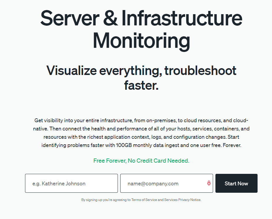
A Bad SaaS Landing Page Subheading:

This is a bad landing page. It was the result of clicking on an add for the keyword “server monitoring tool.”
There’s no attention focus, too many distractions and a lot more wrong with it but let’s focus on the subheadings.
That bulky subheading is intimidating, even though the heading (once you’re able to find it) is clear, the subheading is too bulky to want to read, especially if you’ve seen the competition’s pages.
The content focuses first on the definition of Server Monitoring which is a bad use of the user’s time.
Based on the inclusion of the word ‘tool’ in the keyword, the prospective SaaS user already knows about the basic definitions.
It doesn’t highlight anything specific about the SaaS to the user.
Using multiple Subheadings on your SaaS landing page
Many SaaS landing pages feature multiple SaaS headings. The example below shows a larger, shorter subheading that ropes in the user and tells them more about the features/benefits of their SaaS, all in one sentence.
It then delves deeper into the benefits of their SaaS in a smaller, paragraph-style subheading.
The paragraph could be shorter in some cases, but this SaaS landing page knows that it’s appealing to a more technical audience and can therefore get away with a little more detail.
Extra point for a clear visual hierarchy.
Lead Capture/CTA For SaaS Landing Pages
There is a ‘threshold of understanding’ that your SaaS user must cross before converting on your page.
Knowing what level of comfortability the user needs to reach before they are willing to give you their information is key to not only what you have on page but also what you ask of them.
In most cases, your lead capture (in some cases a CTA button that leads to your SaaS lead capture) will be on the first page.
If the lead capture asks for a ton of information (like name, company, company size, role and email) then tell them more about your company. Set clear expectations for their submission.

What’s nice about this SaaS landing page’s first look is that it’s very clear that the SaaS user is entering this info to get a tailored free demo.
If you read the subhead it specifies that in exchange for that information, they will give you a specific, customized demo. Pretty fair trade.
Conversely, if you don’t have social proof, product images and clear descriptions of your product, there will be too much uncertainty for the user to convert.
Bad CTAs and lead captures
When making a SaaS landing page, here are some examples of bad lead captures and CTAs
Dreaded SaaS “contact us” lead captures
On this landing page the CTA is a ‘contact us’ button which takes the user to a ‘contact us’ page with just a form (sometimes the ‘contact us’ form is on the SaaS landing page).
They don’t clearly explain, in close proximity to their conversion, what submitting the ‘contact us’ form gives the user. They are likely losing conversions for this.
The issue here is that it doesn’t give the user any direction. What do they get in exchange? What should the user say in the message box?
Instead try “Tell Us About Your Project” and have form fields that help you (the advertiser) learn more about the user’s needs.
Try rethinking your offering too. Maybe ‘contact us’ isn’t a good offer. Try what your competitors are doing by offering free demos, free trials, purchasing on the site and so on.
Not Furthering Your SaaS Landing Page Sale

Another fatal flaw is when a SaaS landing page has a call to action, takes the user to the conversion page but there’s no further information on the next page.
In the example above, there’s nothing about what the free trial includes anywhere on the initial landing page nor the conversion page.
If you want users to convert, you have to tell them what they are going to get out of it.
Too Many CTAs

Here’s the same page, sorry random company.
You’ll see that this SaaS has three separate buttons for users to chose from.
It’s a common mistake; this SaaS wants to give potential customers different ways to convert.
However, on landing pages, you will see an improvement if you focus on one. Understand the user’s intent, what your competition is doing and stick with one. Test others later.
Badges/Logos on your SaaS landing page
The next 4 are visual landing page factors that can help your potential SaaS users feel more comfortable with your product before converting.
Most solid landing pages will show badges. Without even looking directly at the individual badges or knowing what they mean, the user will gain trust in your brand.
According to this Edelman survey from 2021, B2B buyers list trust in their top three important factors before converting.
They take up very little space and can add a lot of authority to your SaaS landing page.

Here’s a great example of using customer logos to gain trust (of course these are widely known companies but they don’t have to be).

Above is an example of a company using trust badges from reputation sites.
These don’t have to be strictly on your first look, often they are between the first look and the first scroll but it’s a quick way to gain authority.
Client Success

Showing that you have had client success comes in the form of badges and logos. A visitor to this site will find comfort in the fact that you have worked with others.
Again it does not matter if they have heard of your clients, just that you have had them.

Having reviews on your SaaS landing page can give the arrived users some assurance in two ways:
- Letting them know that others have worked with your SaaS
- Describing relatable situations
Finally, you can also put some snippets of data from recent successes or case studies.
No need to flesh out a lot, a simple ROI stat would do the trick.
SaaS Product Imagery
This is often overlooked on SaaS landing pages. Since SaaS offerings have interface, the users reaching your page will want to know what your SaaS looks like.
SaaS product imagery can be placed behind text, next to your CTA, next to specific features and more.
Platform imagery is a powerful way to distinguish your brand to your user.
Seeing product imagery can give context, help understand features and allows the potential customer to have an image of your product in their head. Very powerful.

Look how much this SaaS landing page shows the users who just got there.
It shows them the backend, and that there are easy analytics views for them to analyze.
This product image also shows the customer-facing front end and established that it is usable on multiple channels.
Limited Distractions
Finally, consider how much is showing when the user first comes to your SaaS landing page. Many pages have so much going on that it’s overwhelming. A landing page doesn’t need a chat, 3 calls to action, customer feedback survey, full header with many navigation and more.
Consider what you need on your saas landing page header
Is it necessary to have the site’s entire directory linked on your landing page header (especially a link to the blog and about us pages)?
I can see the argument for a home link (or linking your logo to the home page) and a pricing page but definitely no need for an ‘about us’ link. That’s just asking for your SaaS user to get distracted.
Creating Value Depth On Your SaaS Landing Page
Social Proof
Although I put ‘client success’ on the first look, the first scroll is a good place to put slightly longer-form social proof.

This could be a case study, a garner review or a long quote from a client.
Visual Feature/Benefits
This is basically your whole scroll.
A typical landing page shouldn’t be more than 3 full scrolls for a SaaS. Especially if your SaaS offering is less technical and easy to understand.
Here some good examples of easily digestible features and benefits on some SaaS landing pages:
- Icons, product images or gifs accompanied by short-form feature and benefit text
- Tabs with features or benefits that allow the user to explore features they are interested without taking up unnecessary space
- Visuals to simplify how your process works


Again, check out your competition, see what they are prioritizing and emulate that.
Here’s a bad example of a first scroll on a SaaS Landing Page

A great thing to keep in mind on your landing page is to have multiple different ways for the user to digest your information.
Having lists, product images, illustrations, videos and more will help all users digest your information.
This landing page offers three videos and no other content. Most users aren’t in the correct setting to watch videos on the spot. Having no other ways to learn about your SaaS product will bounce them fast.
SaaS Landing Page Conclusion
Having simple, diverse, quick, visually organized content is key to having a successful landing page for your SaaS.
Consider your user, why they are there and what stage of their buying journey they are in so that you can properly offer the information they need.
Thanks for reading!